Xiaomi Mi Note Review: a smash-hit in the price war of high-end smartphone
Xiaomi is certainly the fastest growing company in the smartphone industry worldwide to date. The upstart OEM stay on the top leader in their local market where it earns 5 spots out of 8 world’s largest smartphone manufacturers. Last year, the revenue of the company increased by 227% despite the fact that it only entered only 6 countries. Lately, it’s been struggling for the third largest smartphone producer in the world beside Apple and Samsung.
In fact, Xiaomi’s flagship Mi 4 was unveiled last year, a super affordable clone model on high-end Iphone, which had drawn all our attention. Though being criticized a lot, the device made us all surprised by the built quality inside. That was in smartphone segmentation. But now, in high-end phablet segmentation, Xiaomi is targeting directly on Apple Iphones Pluses and Samsung Galaxy Notes with its Mi Note.
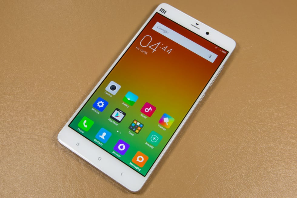
Like Mi 4, the Mi Note is another bang from Xiaomi. With just $370, you will get 5.7-inch, 1080p LCD screen, a 2.3GHz Snapdragon 801 with 3GB of RAM – nearly top of the line specs – smartphone.
In its press material, Xiaomi means to compare the Mi Note to the Iphone 6 Plus, where it has the most resemblance. Though having a bigger screen (57 inches versus 5.5 inches of Iphone 6 Plus), the Mi Note struggles to have a thinner, lighter body (155.1mm × 77.6mm × 6.95mm versus 158.1mm × 77.8mm × 7.1mm and 161g versus 172g). While you are expecting for a competitive device in the same segmentation with similar price, Xiaomi is this for half of the price. A 16GB iPhone 6 Plus costs you $749, so do similar Android phones from Samsung or Motorola cost.
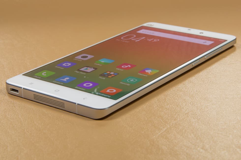
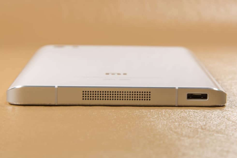
What makes us all surprised about Xiaomi is its ability to produce higher-quality products for less money. The Mi Note is irreproachably well made with premium materials and constructions all around. The aluminum alloy frame with polished chamfered edges and matching aluminum buttons makes it look gorgeous. The front and the back are covered with Corning Gorilla Glass 3, which means -apart from some tiny strips for insulation- there is not a single plastic part on the exterior on a $370 device.
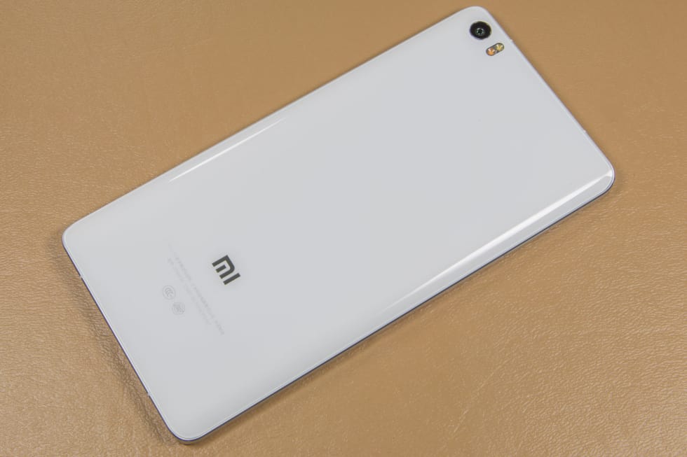
With the thickness of just under 7mm with no bulges of any kind, the Mi Note really gets us think of its own vulnerability (though no smartphone is built to be dropped). We would have preferred a thicker device with more battery, to be honest. However, with all-glass cover, aluminum frame and high quality, Xiaomi does sells it as a premium device. The glass back of the Mi Note is a low-friction surface as it slowly slips off on a table.
However, the Mi Note is not flawless at all. Users most complain the hardware buttons, which are really an annoyance. Normally, the order is Back, Home and Recent Apps. As for the Xiaomi Mi Note, this order is a bit different: Menu, Home and Back. And the Menu button will open the Menu if you long-press it or else it is defaulted to open the Recent Apps, despite looking like one.
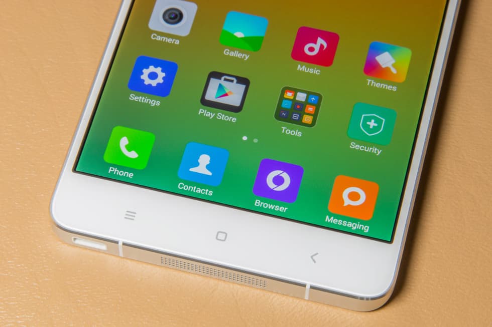
Almost none of the apps on this phone have a menu. Google ejected it from Android ecosystem years ago. Xiaomi’s own Android ROM, has stopped counting on the menu button in the latest version. That’s unnecessary now. It’s somehow like the hardware and the software do not get in sync. The hardware gets a button that the software hardly use it. Practically, it still runs well. It’s just a mislabeled Recent Apps button. The question here is why?
Xiaomi’s rapid development
The ability that Xiaomi listens to customer feedback and use them to upgrade its next products is the most impressive aspect compared to how Samsung works. It’s been 4 years since Samsung Galaxy S2 was released but we can see similar complaints on Galaxy S5, such as: cheap-feeling plastic back panel, boring Touchwiz and ton of gimmicks.
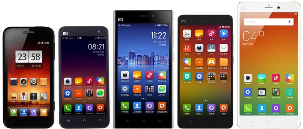
On the other hand, Xiaomi is developing surprisingly. In the Mi 4, the back panel is plastic, still brings cheap-feeling, so for the next season of Xiaomi’s smartphone, the Mi Note, it is replaced by Corning Gorilla Glass. The company’s custom Android ROM, MIUI 5, relied on a lot of skeuomorphic elements, but MIUI 6 has a more modern, flat design. Hiding options behind the menu button is a dated, confusing interface feature. Therefore, the Mi Note still has a menu button but the company default it as a Recent Apps button.
The appearance of the Xiaomi Mi Note is also improved. When Mi 4 was released, people said it looked like Iphone on the front and Samsung on the back. But, circumstances alter cases. The Mi Note gets unique design touches that can tell it apart from others.
Visually, there is still a metal band around the outside, but it tapers along the sides of the phone, giving it a more distinct look. The curved-along-the-sides glass back not only give it an odd and unique design, but also makes it easier to hold. The most interesting point is that these are all the improvements from the Mi 4, which was released just 5 months ago.
Recently, Xiaomi announced that it was slowly approaching the US market by launching a version of its e-commerce site, Mi.com. Though being criticized for copying Apple’s design, the company itself proves to be a strong one in the Amazon mold. It want to makes money on building a good system of service.
For now, Xiaomi says selling smartphones in the US is not planned yet but it will start selling accessories like headphones and external batteries instead. Still, it is hard for us to imagine that a company opens store in the US but not to sell its mainstream.
The reason for Xiaomi not to sell smartphone in the US is mainly that, with the current lineup, Xiaomi will be vulnerable to trade dress and patent lawsuits from such companies like Apple and Samsung. The company will play intellectual property game, though. The company hopes to double the number of this patent as this figure was 2000 last year. If Xiaomi does want to spread out to countries with strong IP laws like the US, it will need to innovate its software and alter any feature that could be intruding. If Xiaomi starts selling smartphones in the West, lawsuits for it is certain since, in an IP landscape, every smartphone company seems to suit the others.
MIUI 6—Flat, but a little too overwhelming
MIUI (pronounced “Me-You-I”) has changed a lot since we last saw it on the Mi 4 – the whole new version has been released. When MIUI 5 was skeuoumorphic and could do crazy things like making voice recorder a cassette tape, the MIUI 6 has gone totally different direction. The OS now is really flat with no shadow or bevel to be found. Backgrounds are usually a flat color, with some popups having an iOS 7-style hint of the blurred colors underneath.
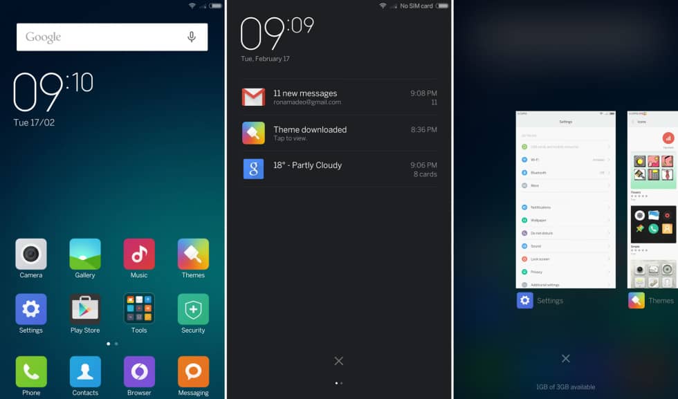
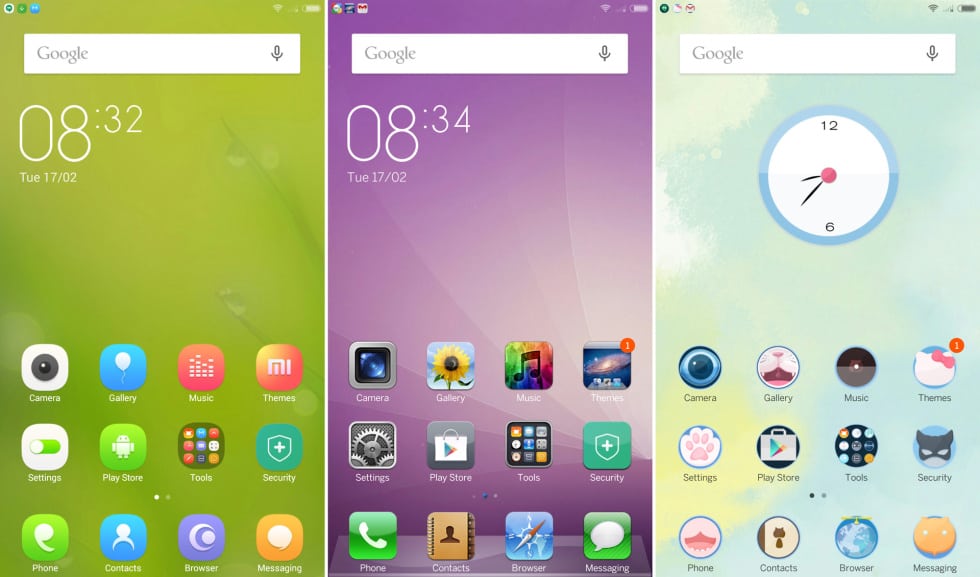
The ‘getting thing done” area of an app is usually white with gray header, and sometimes you can’t choose other colors. Some may say it follows minimalism but, the others says it dull plain. The good news is you can change the theme whenever you get bored with the screen. Right on the home screen can you find an icon for theme shop, where you can change the icons, wallpapers, fonts, sound… and the look of many included app.
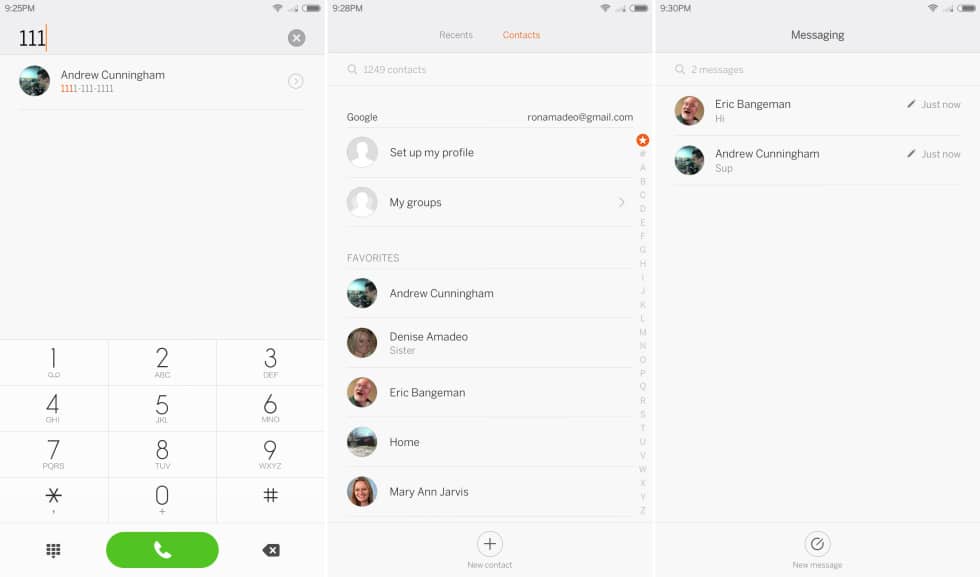
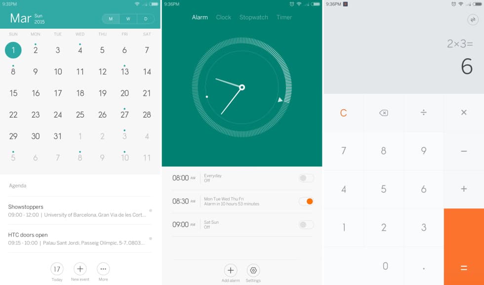
There is a microcosm of the OS. That you can customize MIUI is the best part of it. The setting panel contain all the changes you want such as the font and icon size, the display of battery as a percentage, the display of your connection speed in the status bar and the notification light color. Also, you can add long-press shortcuts to the hardware buttons, configure in-line headphone buttons, and lots more. If you like to tweak your phone, MIUI has got everything you can think of.
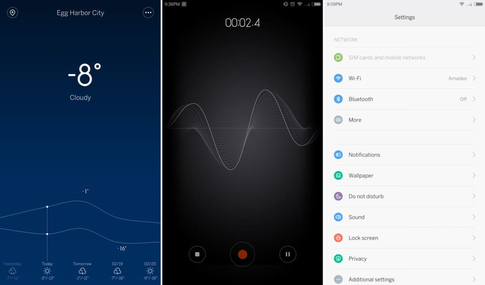
As for the functionality, it will take you some time to get used to MIUI as it is an iOS/Android mix. MIUI 6 is based on Android 4.4 KitKat, but the heavy customization makes it hard to realize. There’s no app drawer – icons all sit on the home screen iOS-style. The notification panel can be opened by a horizontal swipe, not a vertical swipe as usual. Recent Apps now uses horizontally scrolling full-screen thumbnails just like iOS (and WebOS).
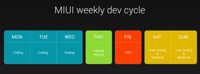
Unlike the customized Android built from many other vendors, Xiaomi has started making its own Android ROMs even before it shipped a phone. The company takes its software very seriously. Above is the released MIUI schedule. It gets weekly OTAs while many other smartphones are so lucky to get an OTA once or twice a year. Though the weekly updates on MIUI are not as big as bi-annual changes on others, bugs get fixed particularly quickly. Small features are also added through time.
The incredible speed of MIUI makes it better than other Android version as it runs so quickly and smoothly. While many OEM skins seem to slow down and add bloat, MIUI feels faster than “stock” Android.
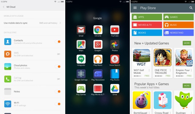
According to the Mi Note preview units, provided to the US press by Xiaomi, the phone fits full suite of Google Play app. You got the Play Store, Gmail, Google Play Services, YouTube, Google Now, Google Keyboard, and everything you would expect. This is a full upgrade from the Mi 4 as the Mi 4, imported from China, did not come with Google Play and had to use Xiaomi’s app store. Google has not entered China yet, so Xiaomi is not forced to ship Google Play on China-bound devices.
At the beginning, the Mi Note asks you to pick location from the list containing only countried where Xiaomi sells phones. Oddly, when choosing the location, you are picking Xiaomi’s ecosystem model for your phone. If you choose the place where Xiaomi has just entered the market, like Singapore, you will only get Google Play for an app and that’s all. Nevertheless, wipe it out then pick Hong Kong instead, you will immediately get Google Play and Xiaomi’s app store. The app loadout changes depending on the country you pick.
Weirdly, China, where Xiaomi has the biggest ecosystem, wasn’t on the list of countries. There the company sells games, apps and themes. Among the wide range of apps we tried, the most we could get from Xiaomi app store was free apps and themes. The e-commerce ecosystem is apparently an important part of Xiaomi’s business model, so it’s interesting to see the company dispatch Google Play and sell apps and themes in most territoties.
Performance
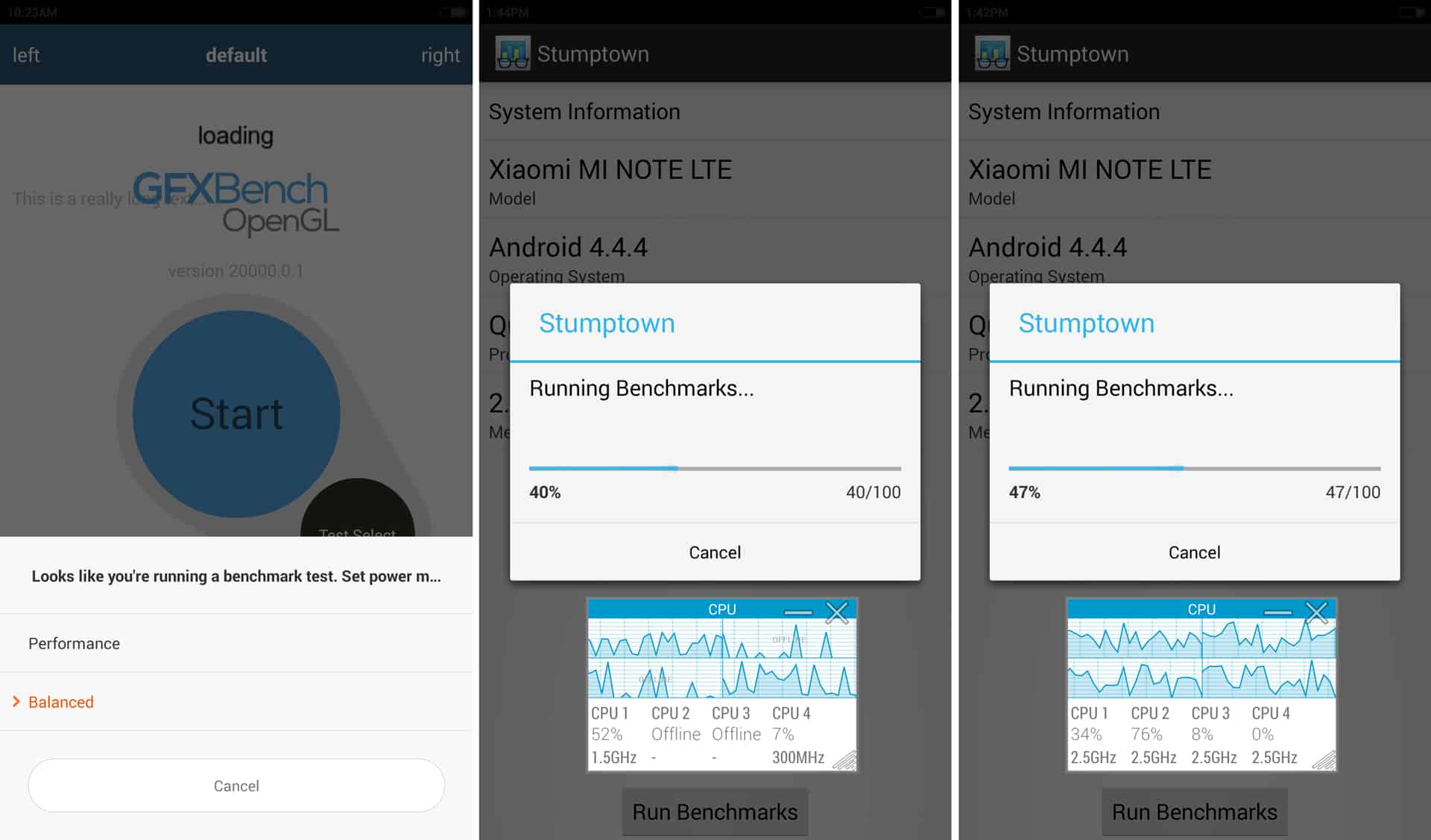
Xiaomi has given the Mi Note two performance modes: “Balanced” and “Performance”. The “Balanced” mode is default. Performance of this mode is normal and unlimited that most phones use. “Balanced” violently infringes the CPU, and if all four cores are running, it seems to reach the limit of the max of 1.7 GHz. Generally, benchmark shows it was about 22% down in CPU performance. This does affect the GPU or storage speed.
We doubt that consumers will never dig through the Setting to find “Performance” mode, so for most of the time, they will be running “Balanced” mode. The interface design expects users to be mostly in “Balanced” mode. Enabling “Performance” mode initiates an unremovable battery usage warning in the notification panel. We were encouraged to switch to “Performance” mode when starting a benchmark but never for a game.
In the OS, the “Balanced” mode does not tend to slow the phone down. Everything runs at an acceptable pace, properly owing to how smooth MIUI is. CPUs are powerful enough to handle loading and scrolling 2D app. We also played some games, like Minecraft, and it ran well. But the “Performance” is always available if you want.
Apart from being a funky power-saving mode, it’s standard Snapdragon 801, which is normally good.
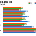
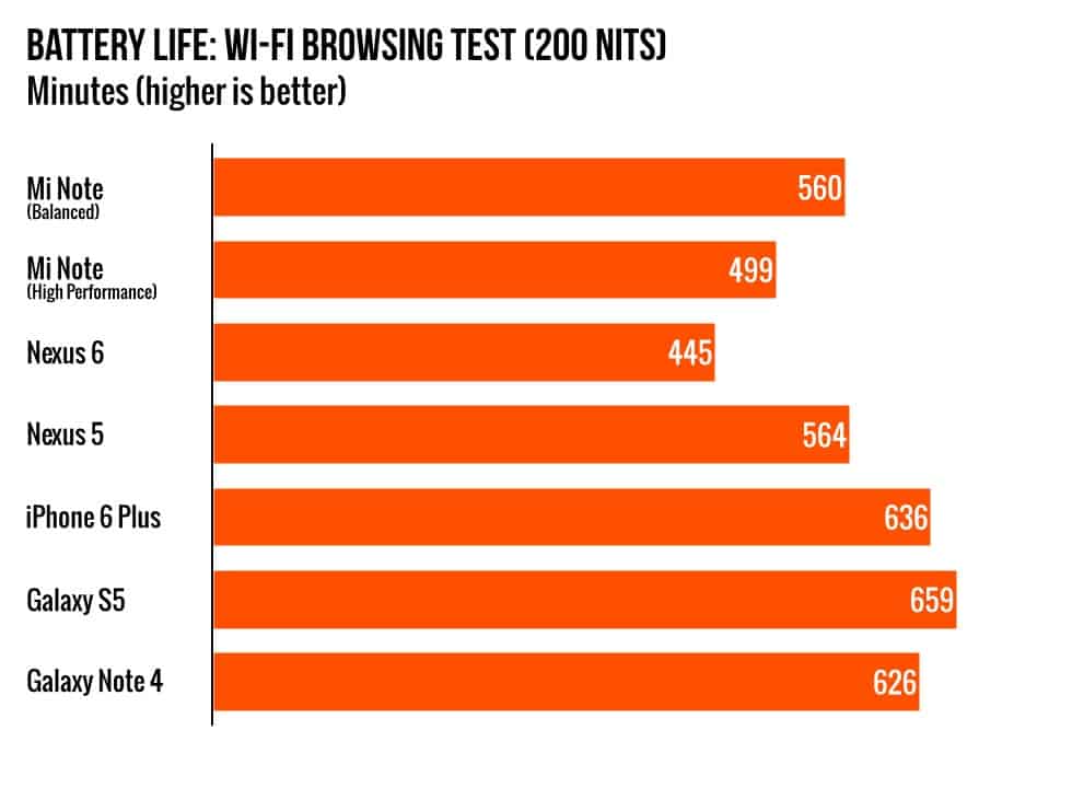
Here are some comparisons between 2 modes of Xiaomi Mi Note and other popular smartphones.
Battery life of the Mi Note is acceptable. The “Balanced” mode gave the phone an extra hour to runtime, this makes sense. The SoC will use less power but a blazing 5.7 inches LCD will definitely draw more power.
At 5.7-inch-sized screen, we can have expected a bigger battery capacity than 3,000 mAh. The similarly sized Note 4 got a battery of 3,220 mAh and the 5-inch-sized Mi 4 itself got 3,000 mAh. Sometimes, pursuing thinness is not necessary. We want more battery.
There are still many complaints about this but it’s hard to complain about a $370 device.
Camera
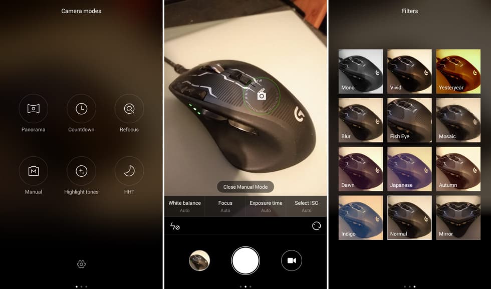
There is no doubt that the camera department of the phone is great. Xiaomi Mi Note’s 13Mp camera (with OSI) gives wonderful pictures, sometimes better than the Note 4, which is twice as more expensive. You also get lots of options, like manual exposure time—up to 32 seconds—selectable ISOs, and a torch mode for the flash.
Xiaomi is probably the best Android OEM
Though Xiaomi’s criticized designs create many jokes in the US, this company should be taken seriously. Both phones from Xiaomi to be tested prove to be fantastic devices.
Beside prices, both bring customers with premium feelings that can compare to the best of Apple and Samsung. But when the prices are under consideration, it is obviously an unfair fight. $749 iPhone 6 Plus and $700 Note 4 versus $370 Mi Note. We can only compare the pros and cons of each product to that of the others. Why do you have to pay twice for a device that has got everything similar to the Mi Note?
There will be some aspects that Iphone and Note are certainly win. The Note did get Samsung’s S Pen or multi-window functionality to use with big screen. It also has a few more pixel and GHz. However, the Mi Note is not done with the spec sheet war. The Mi Note Pro is as Xiaomi announces that is has a Snapdragon 810, 4GB of RAM, and a 1440p display for—somehow—$528. As for the Apple Iphone, it has its own ecosystem, so that it is more resistant to competitor (in Q1 of 2015, the sale of Iphone increases considerably by 70% in China) but it’s no wonder Samsung is reeling.
Honestly, we don’t know how the company does it. There doesn’t seem to be any corner that Xiaomi had cut to create such an incredible device. There is no light bleed from the display, and either the camera or the speaker is really good. It makes all wonder how come we should spend $600 for a high-tech toy with similar spec.
Xiaomi proves itself a disturbing agent in the smartphone industry. The company listens to customers’ feedback and immediately improves. Weekly software updates are also offered to users for better experience. It can make a high-end device for half of price compared to similar ones of other players in the competition. One thing that makes us feel disappointed in this phone is the country availability, for which is mostly China now. If you can buy it in the US, it will be the best phone with just $370.
Good
- It will only costs you $370 for something that other OEMs sell for $600-700.
- It’s one of the best-designed Android smartphone with all glass and aluminum cover.
- The performance is really fast.
- Weekly software updates.
- The camera has lots of control and different choices of mode.
Bad
- The Menu button opens to Recent Apps rather than the Menu.
- The glass back is nice but it slips off when being put on an imperfectly flat surface. It’s almost frictionless.
- The glass exterior causes fragile feeling to users. Don’t drop it.
Ugly
- Almost available in China only.
