Android 6.0 Marshmallow vs Apple iOS 9: HOT visual comparison
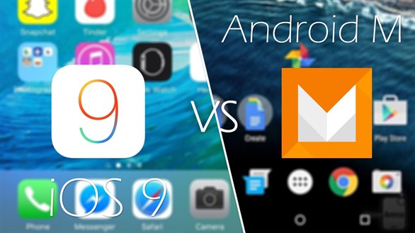
TWO most popular operating systems for smartphones nowadays are Android and iOS. However, have you ever thought carefully about their differences in terms of visual interface? If not, let’s move on to next parts where we would like to look at the main things helping distinguish between the 2 newest OSes: Android 6.0 Marshmallow vs Apple iOS 9 in a visual comparison 😉 . Which one is the right for you?
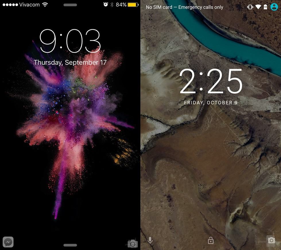
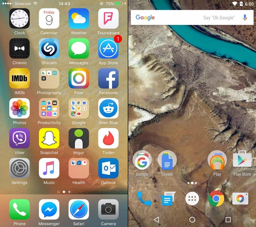
#1: Lock and home screen
In the part, we want to introduce the lock and home screens of an Android phone and an iPhone. Of course, the first thing you will see right after pressing the home button is the lock screen and then the home screen. In general, those on Android 6.0 and Apple iOS 9 are not very different. As for the under-the-hood proactive functionalities, iOS 9 chooses to display 2 shortcuts to some frequent apps, placed in the lower left corner of the screen. Meanwhile, Marshmallow has replaced the dialer shortcut with a Google Now (“an intelligent personal assistant developed by Google”) voice search shortcut. Do you think that will be more convenient for Android users?
At this point, we kind of prefer the iOS since with a shortcut to a specific app like camera or message, we will save a bit more time. But, that’s our opinion, how about you?
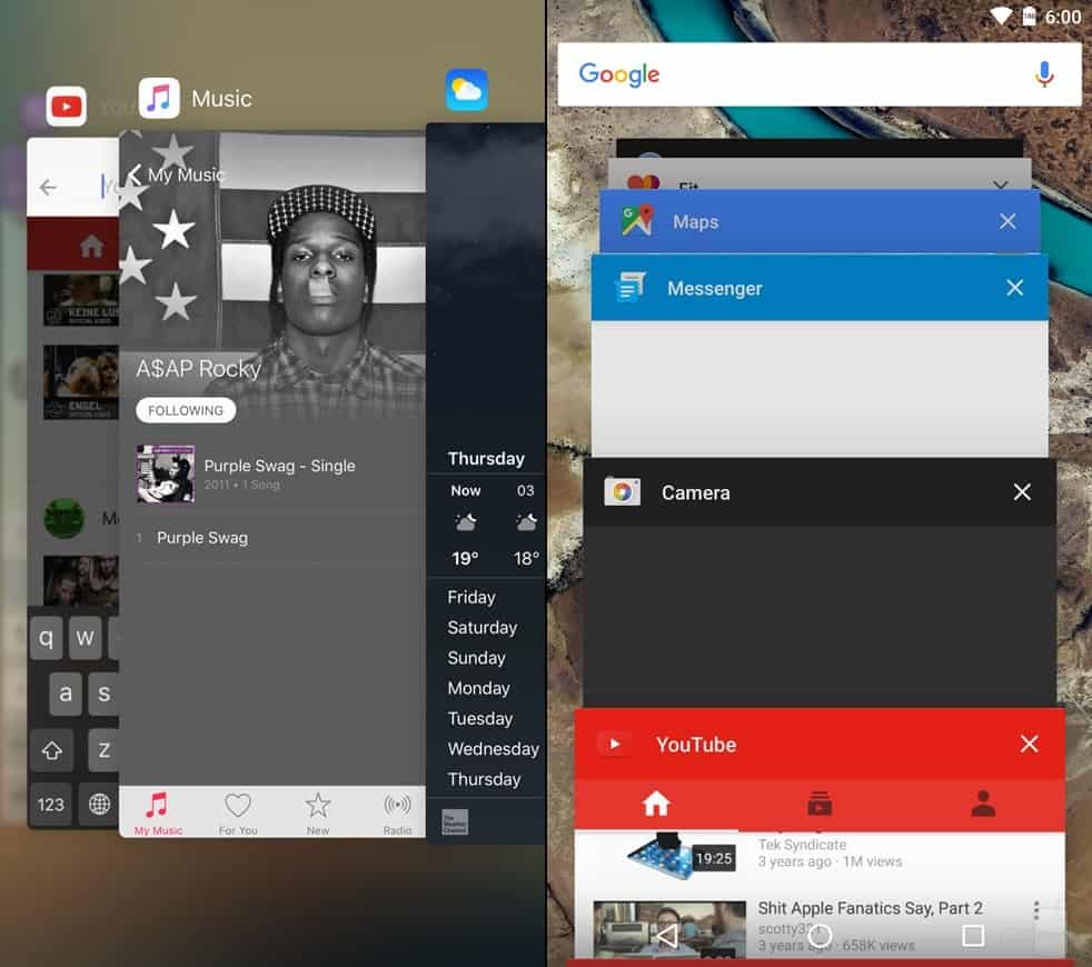
#2: App switcher
We can see that Apple has made the iOS 9 more beautiful when setting the apps to be displayed in a more fashionable way. Moreover, browsing them gives us a feeling like flicking pages of a book, just back and forth. For Marshmallow, the app switcher does not change much if compared to Android Lollipop. All the apps will be listed downwards.
Nonetheless, we do not see something like a “clear all” button on iOS 9 or Android 6.0. So, if you have a bunch of apps, you still have to close one by one 🙁 .
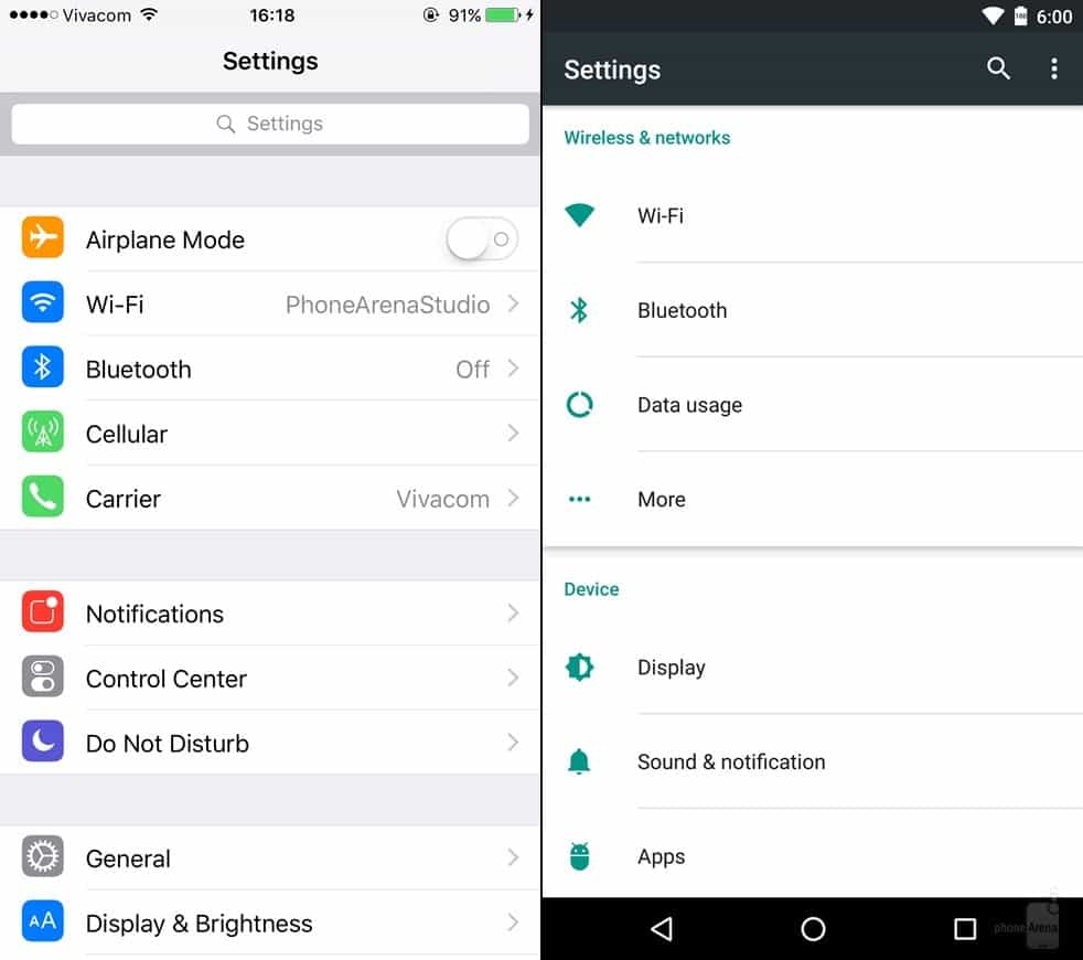
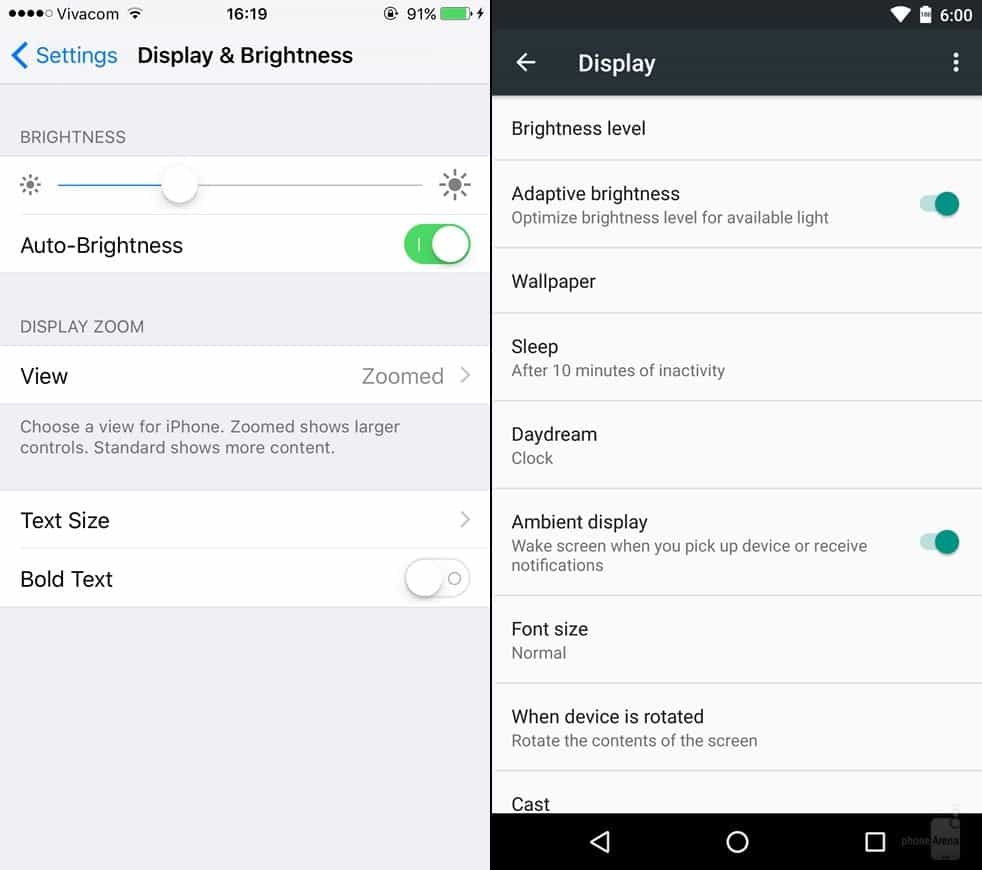
#3: Setting menu
On the platforms of both the iOS 9 and Android 6.0, there are search functionalities which allow you to search for anything and they will be displayed promptly. Sound good?! One more similarity is that both OSes do not stock dark theme. We have to go with the light default background as usual. Hopefully, iOS 10 and Android 7.0 will give us a choice next year 😉 .
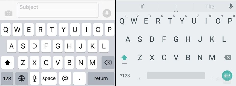
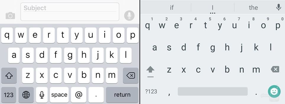
#4: Keyboard
One plus for iOS is its new upper case keyboard. Now, when you want to type any capital or non-capital letter, you just need to press the arrow button and it will shows what case you’re typing in. Cool! As for the Android keyboard, there is no difference from the Android Lollipop to mention since we guess it has been good already.
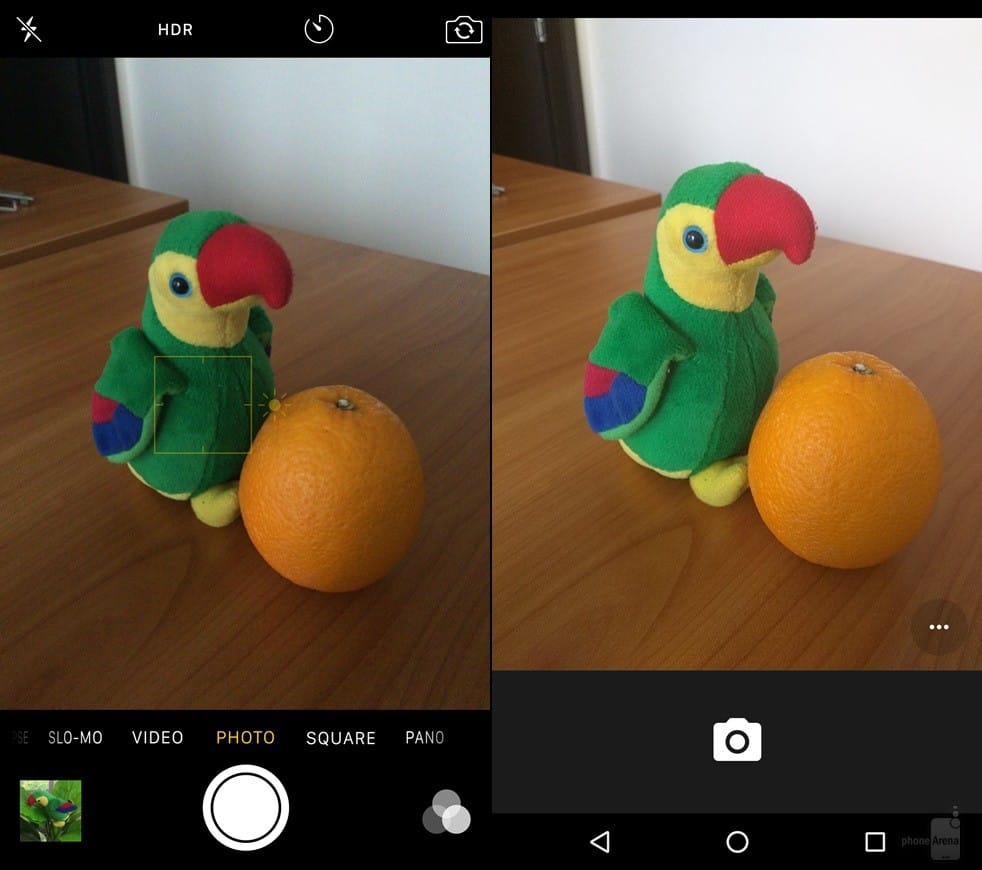
#5: Camera interface
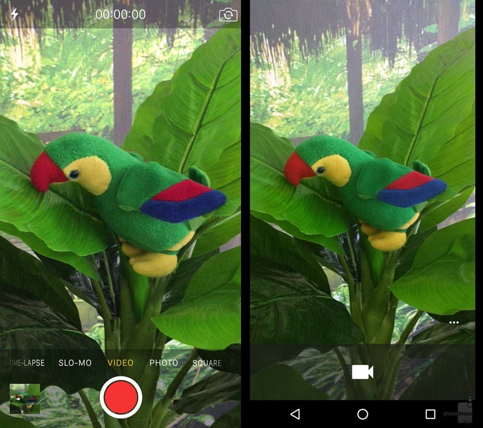
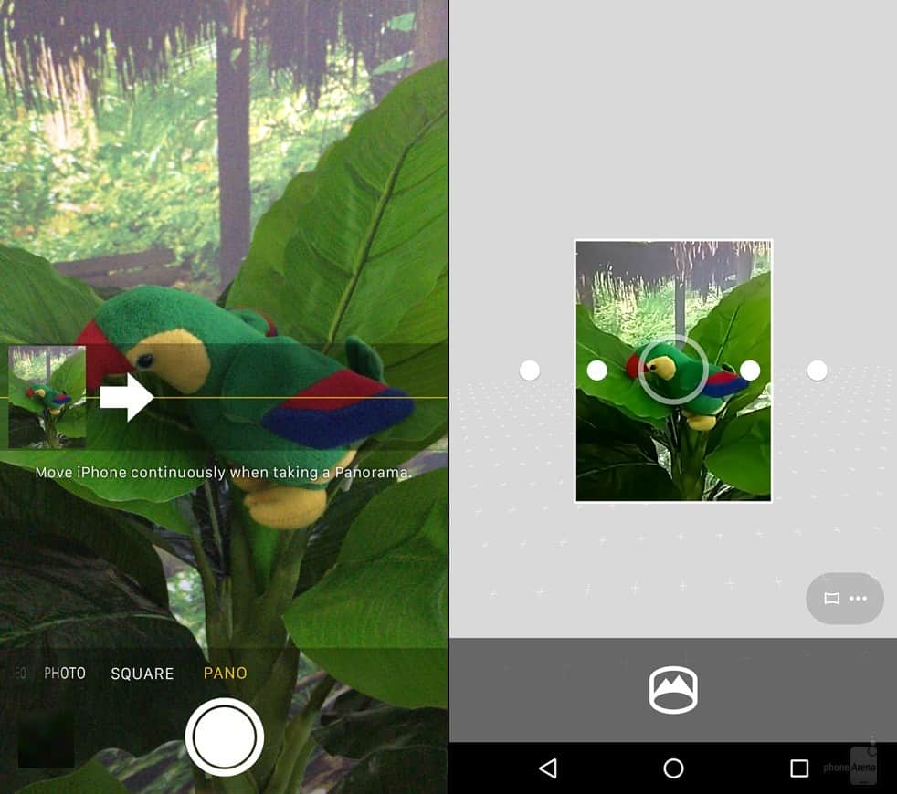
Looking at the pictures, the Android 6.0 interface is brighter than its friend and perhaps even more beautiful. Nevertheless, some people would prefer the iOS, for it offers many features on the screen when you are capturing a photo, so that you easily change or turn on or off a feature at any time.
Talking about specific functions iOS and Android bring users, we notice that the iOS camera app enables you to shoot regular pics and videos, Time Lapse, Slo-Mo, and Panorama. And Marshmallow camera app gives you Photo Sphere, Panorama, Lens Blur, and video recording as its defining features.
Well, those are the basic things about the differences of Android 6.0 Marshmallow’s and Apple iOS 9’s visual interfaces for now. If you have more ideas to add in, tell us 😉 . We would like to know!
(Source: phonearena)
